01The Brief
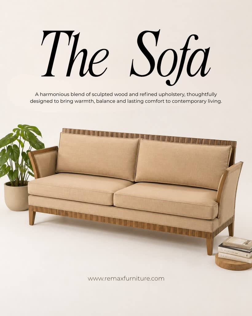
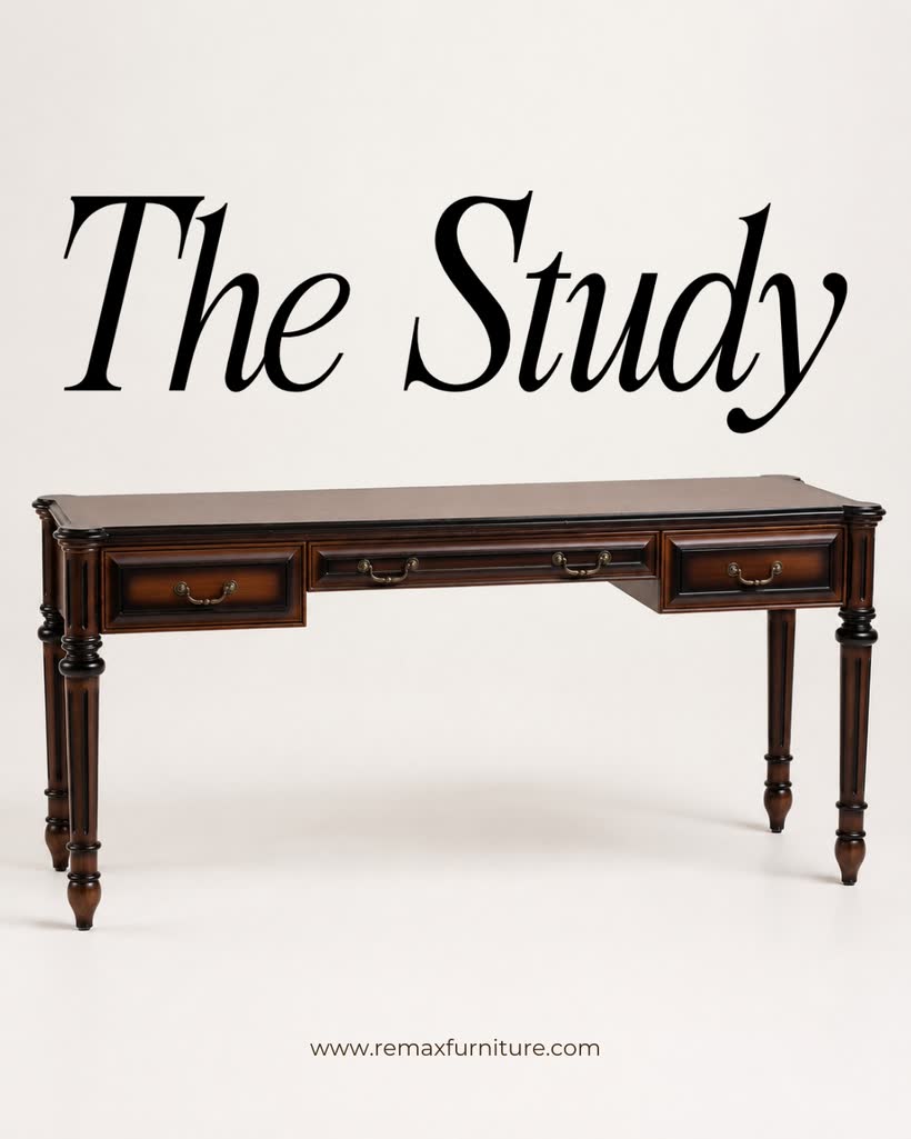
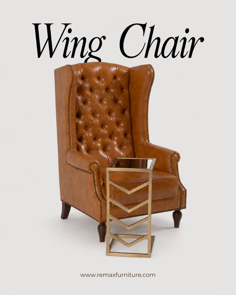
Remax Furnitures handed over six product photographs — an armchair, a sofa, a writing desk, a wing chair, a sculptural console and a marble side table — and one ask: make them feel like a brand, not a catalogue.
So I built three art directions from the same six pieces, wrote the on-image copy, and laid out nine Instagram carousels plus a festive story — designed so the covers snap together into one continuous scene on the profile grid.
02One shoot, three moods
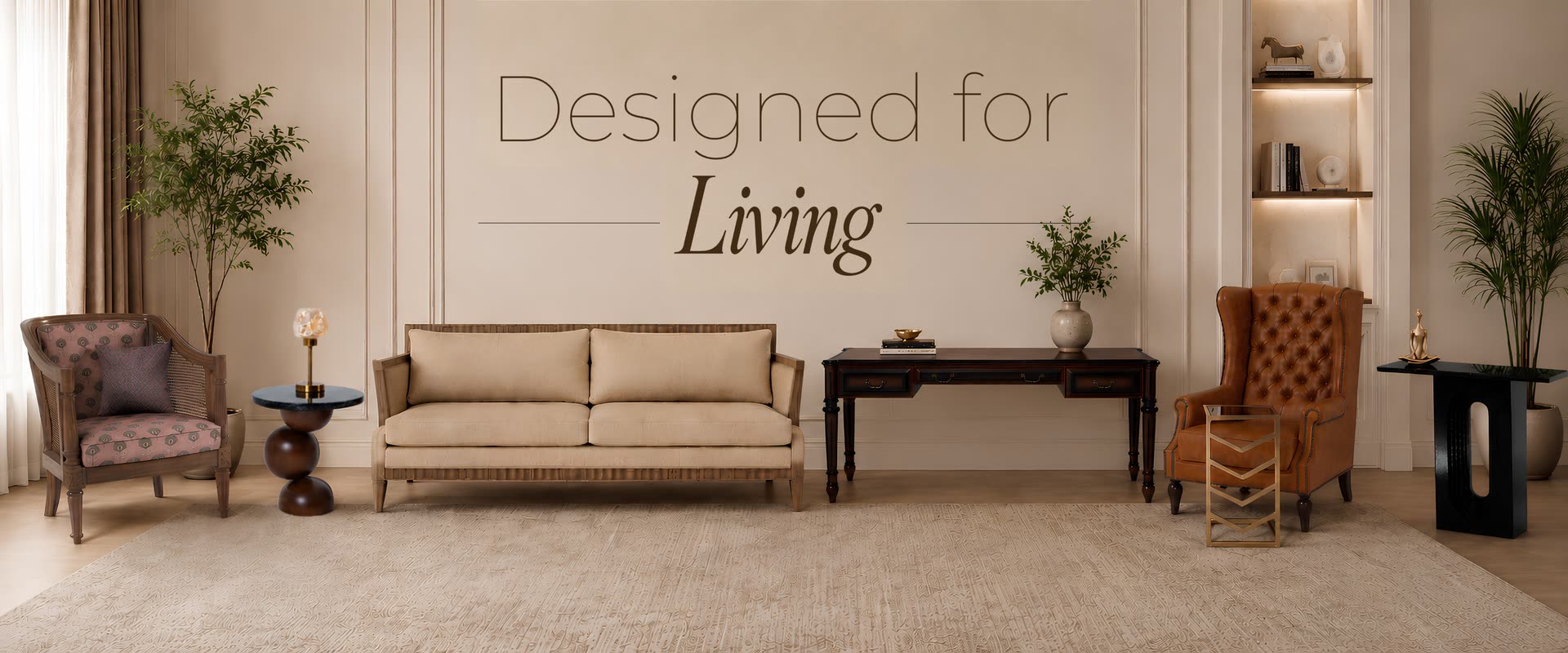
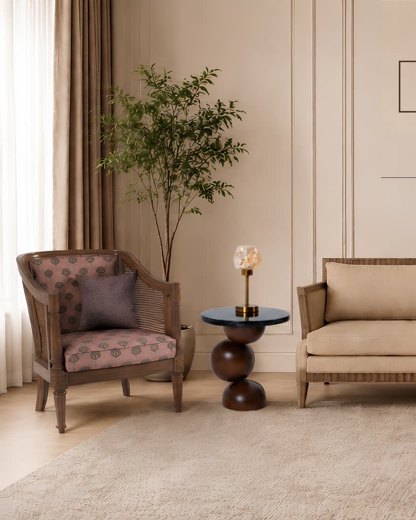
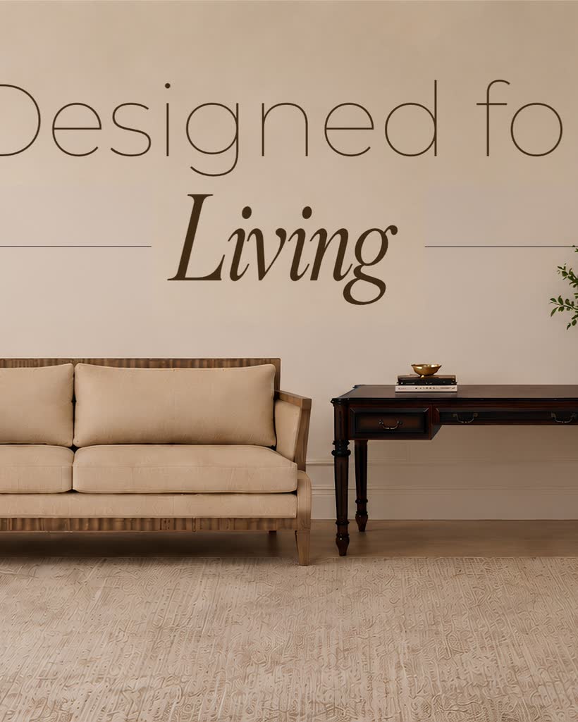
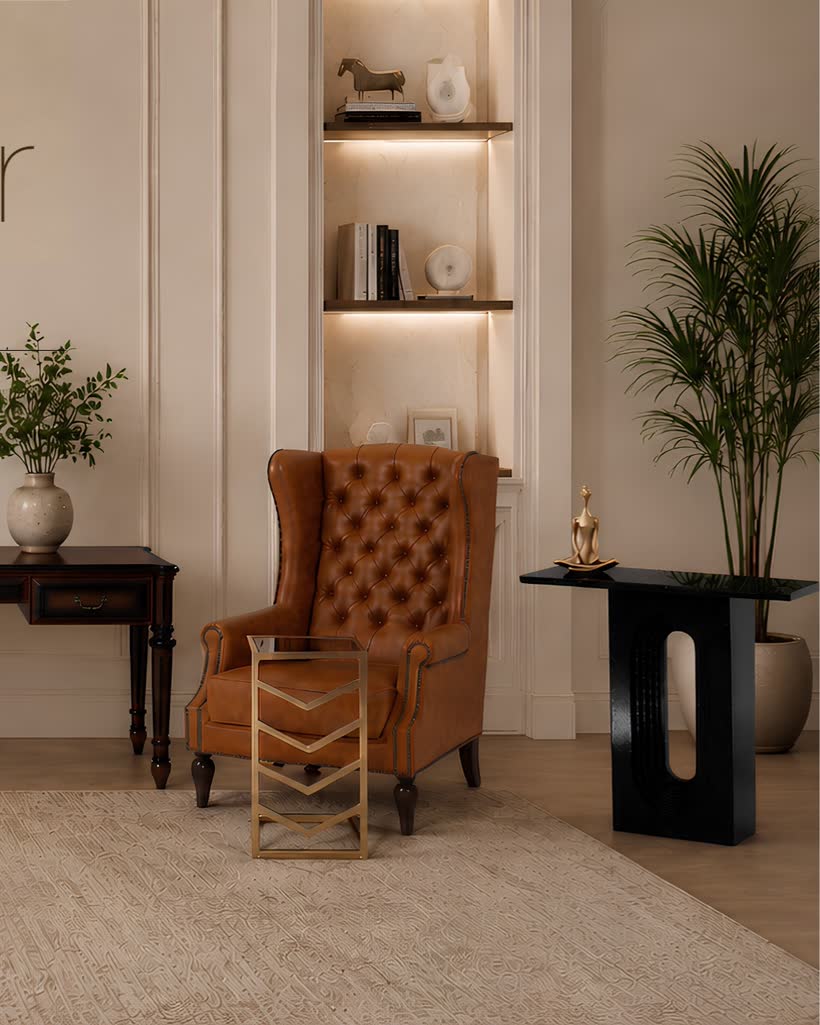
Homely. A lived-in room — soft daylight, curtains, greenery and a patterned rug. The furniture is styled the way you'd actually keep it, so the buyer pictures it in their own home.
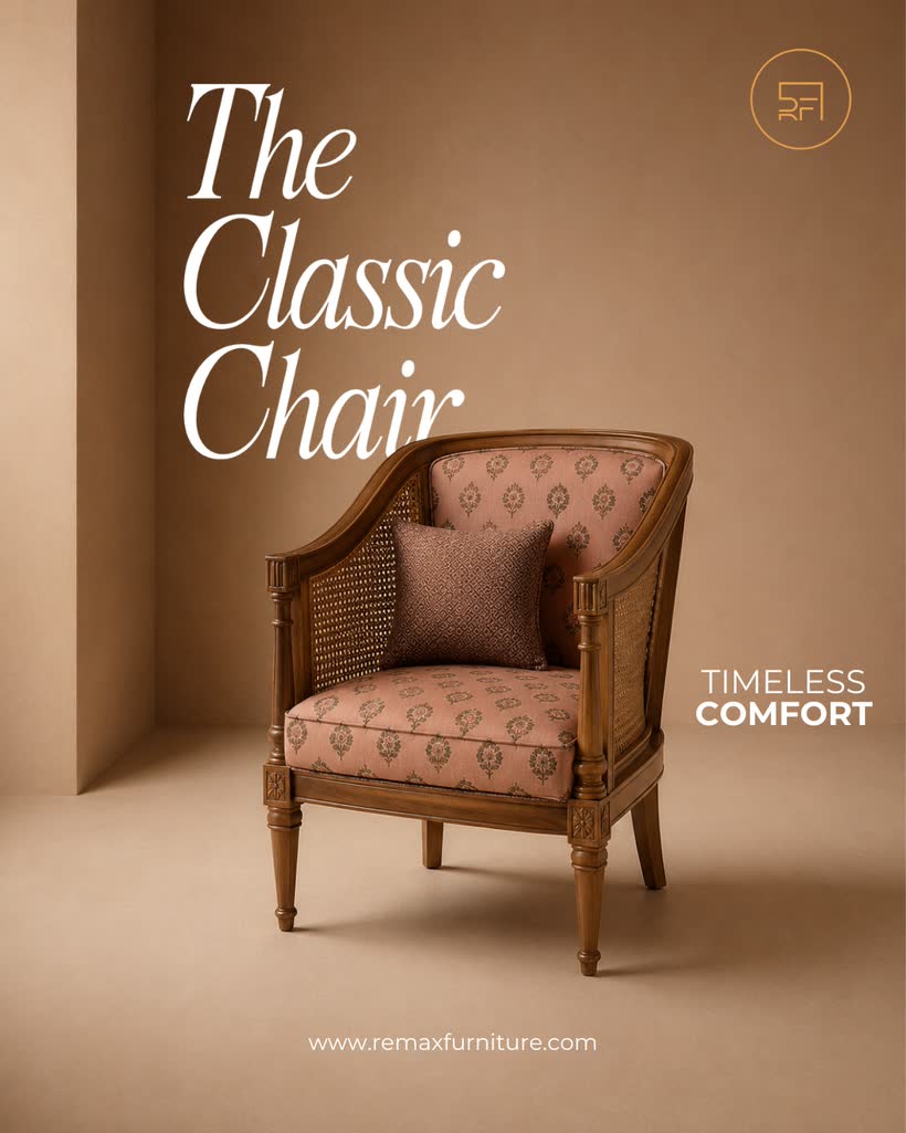
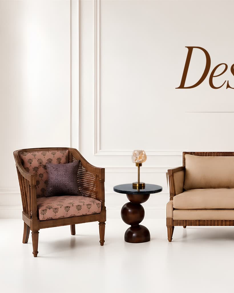
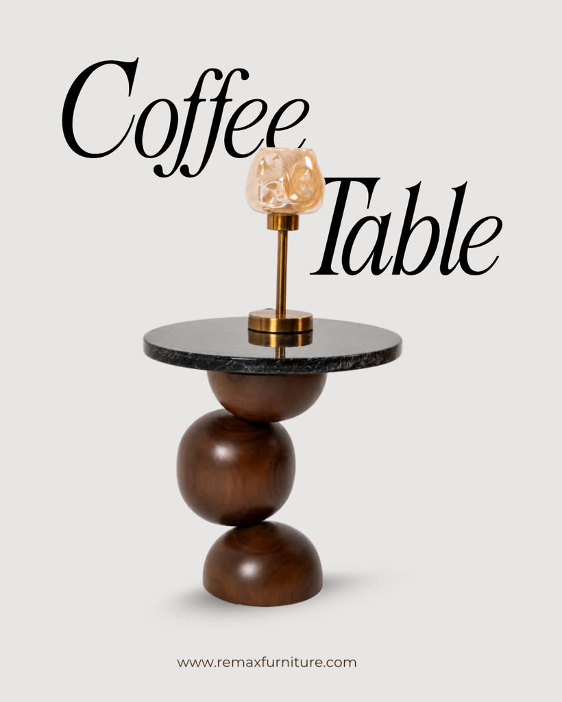
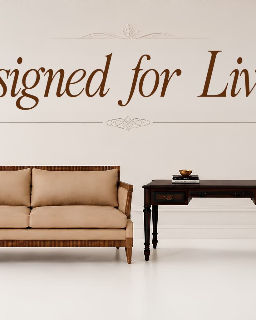
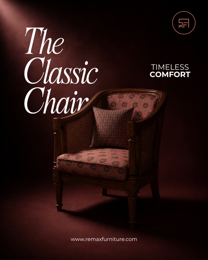
Studio. A clean white set and an elegant serif wordmark. Every piece lined up and evenly lit — the crisp, catalogue-grade view that lets the craftsmanship speak.
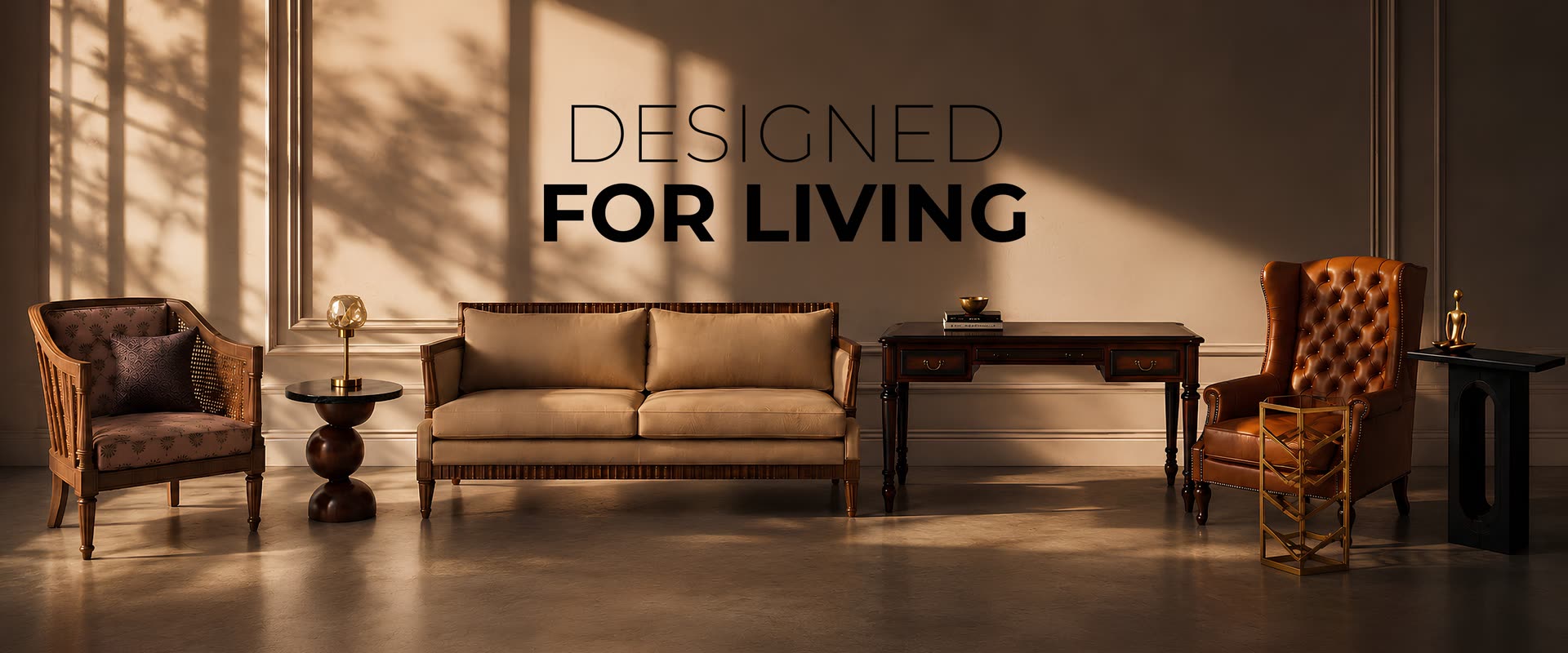
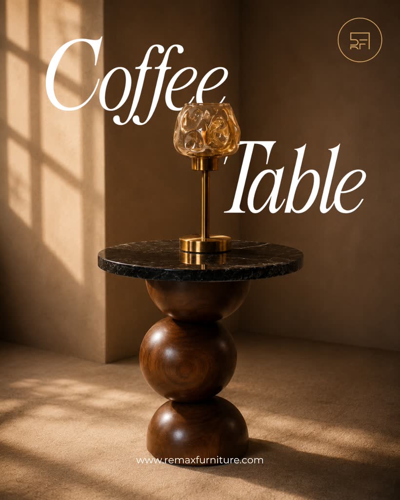
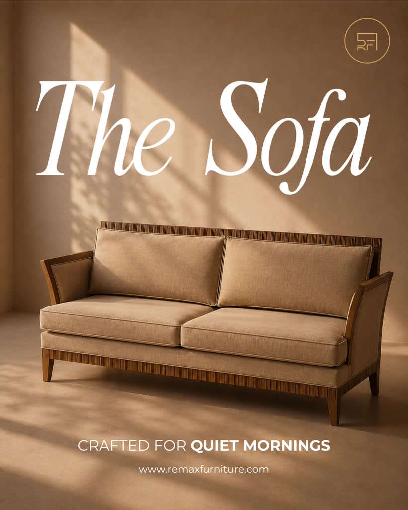
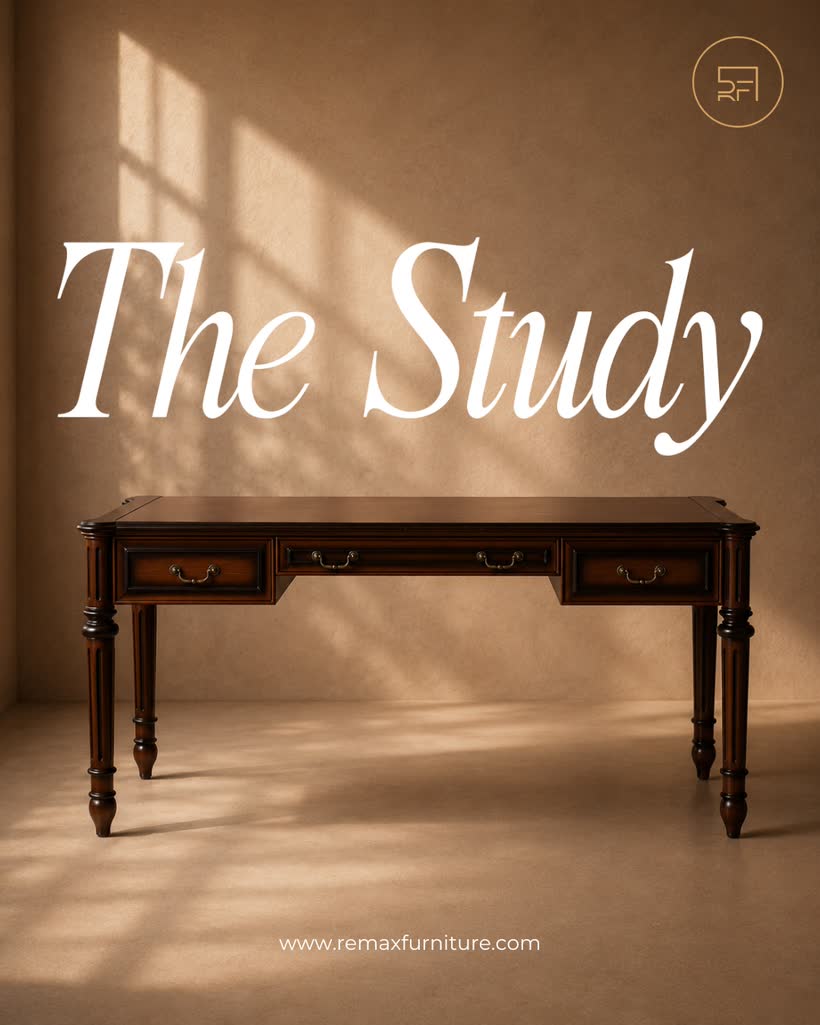
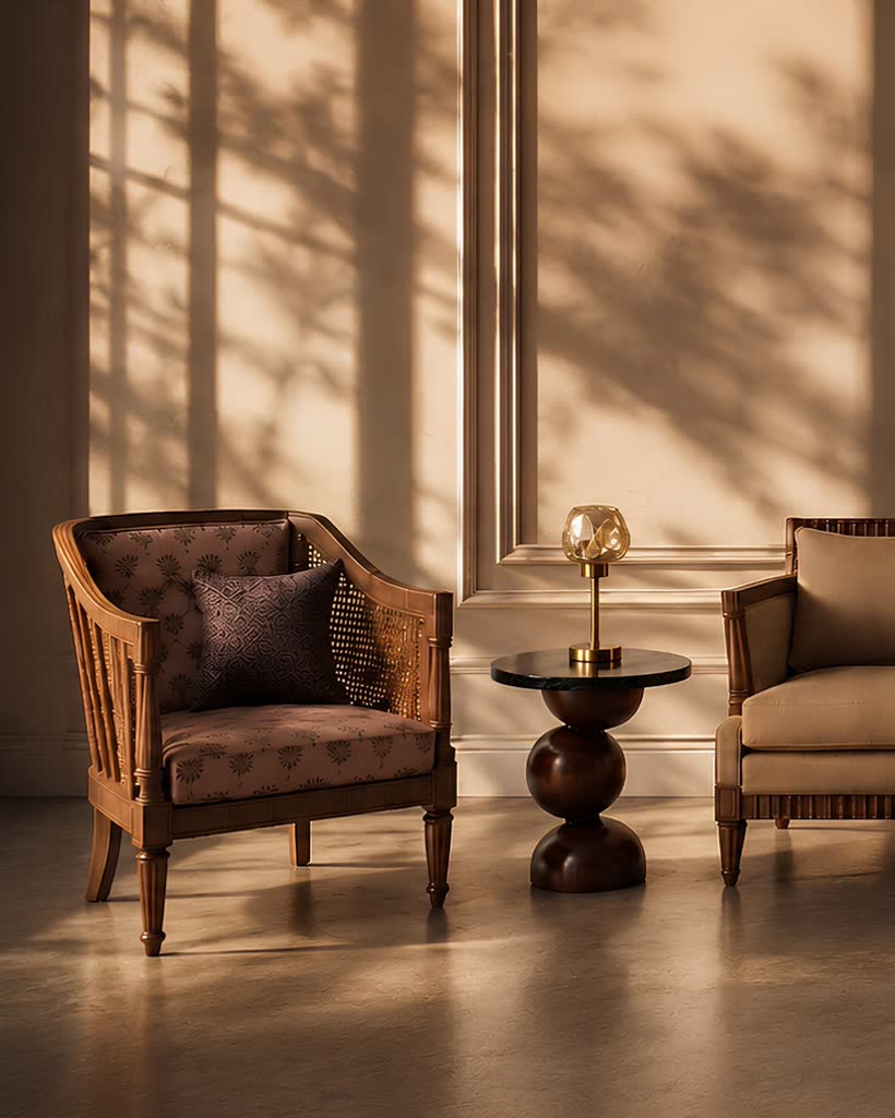
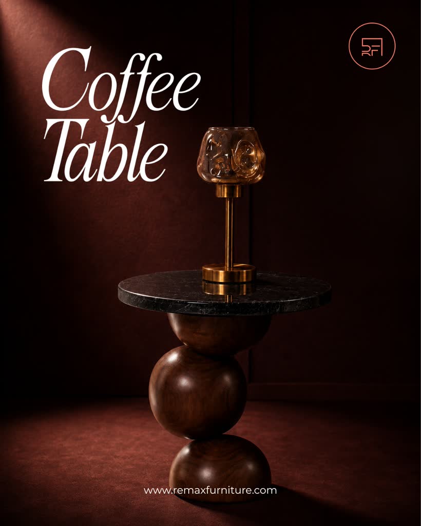
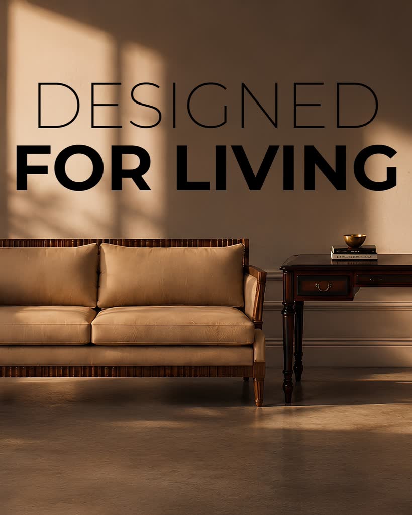
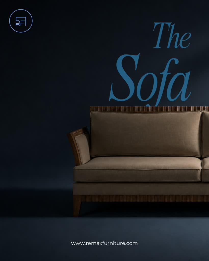
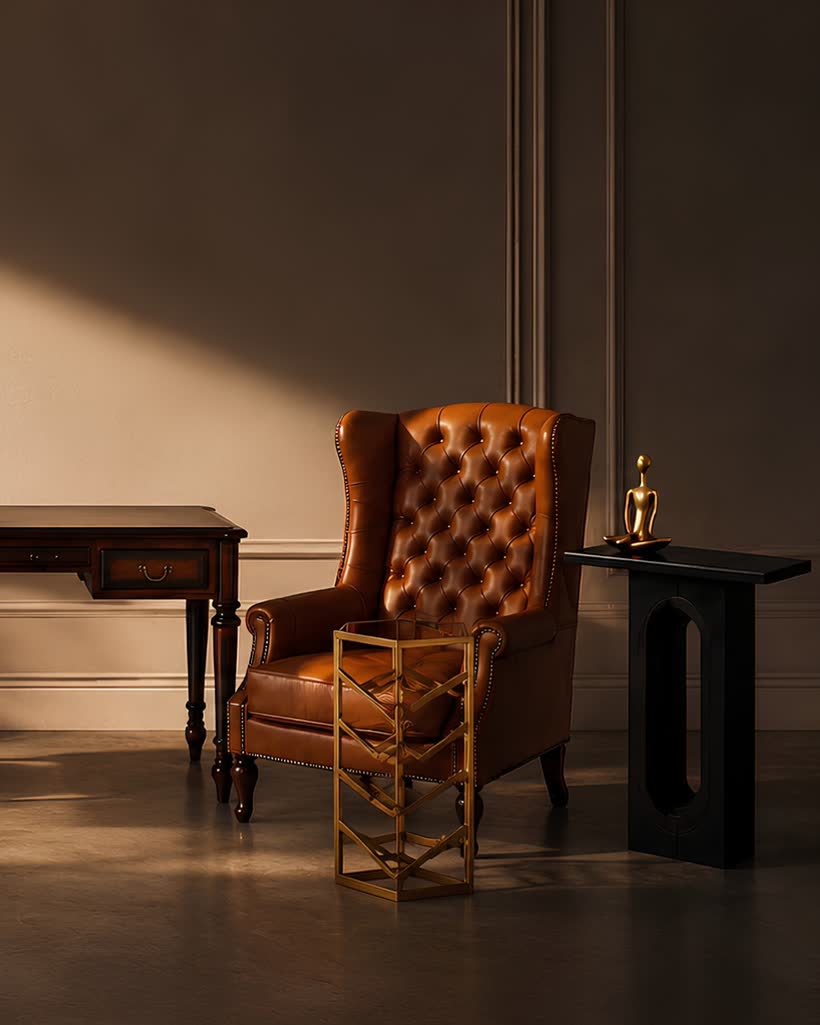
Cinematic. Golden-hour light rakes across the wall in hard window shadows. Bold, high-contrast and premium — the mood-first frame that stops the scroll.
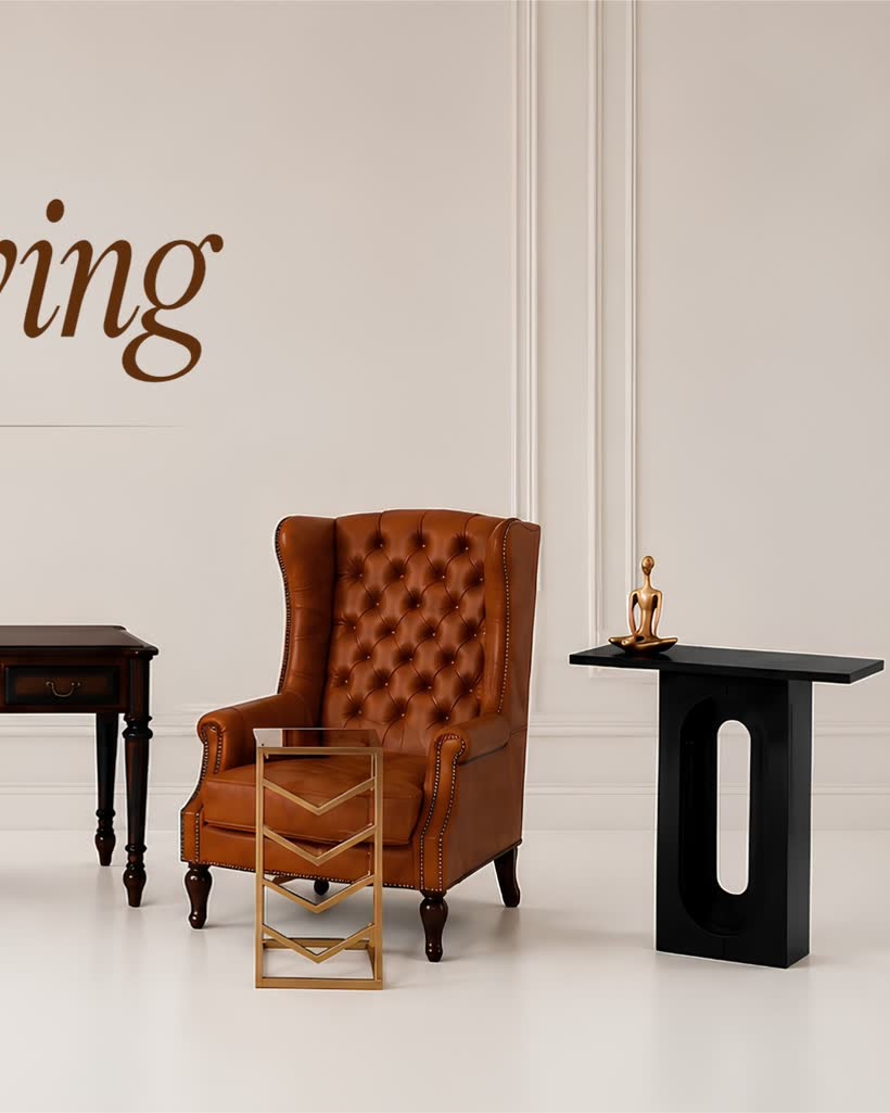
Three posts that read as one
Each carousel's cover is one-third of a wider scene — posted in order they line up across the profile row into one storefront. This preview cycles all three vibes; hover to pause, or toggle the covers apart.
03Inside the carousels
Every post opens on its styled cover, then swipes to two product spotlights. Browse all nine below (hover a card to auto-play its slides) — or pick a single vibe to open a mini case study of its six product frames, full-size.







Lived-in warmth
Shot as a room you already live in — soft window light, layered textures, greenery and a patterned rug. Each of the six products is styled in context, so buyers picture it at home rather than in a showroom. The full set, full-size:
Catalogue clarity
A clean white set with an elegant serif wordmark and even, near-shadowless light. Every piece is isolated and precisely lit — the crisp, e-commerce-ready view that lets the craftsmanship carry the frame. All six, full-size:
Golden-hour drama
Hard window shadows rake across a warm wall, bold caps, deep contrast. Here the mood leads and the product follows — the scroll-stopping frame built for the top of the feed. The full set, full-size:
04A festive corner
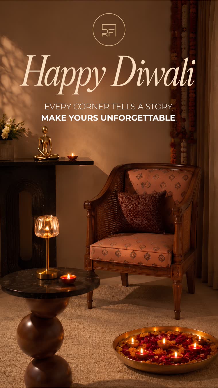
To ride the season, I designed a Diwali story — the cane armchair lit by diyas, marigold garlands and a brass urli of floating flames. Warm, intimate, and unmistakably on-brand.
"Every corner tells a story — make yours unforgettable."
05What I Learned
One asset set, many stories
The same six photos can feel homely, clinical or cinematic — direction, light and type do more work than new photography ever could.
Design for the grid, not the post
Planning the covers as one panorama turns a profile into a storefront — a small constraint that makes the whole feed look intentional.