01Overview
Most drink websites are a product grid with a hero image on top. This one asks what a beverage launch feels like when the page itself behaves like the ad.
A self-directed concept and motion study for PRIME Hydration — built end to end, from art direction to the animation engineering. The goal wasn't a brochure; it was to make scrolling feel like the product reveal.
02Direction
What if the scrollbar were the edit — the thing that cuts the film, mixes the flavor, and builds the bottle?
Four decisions shaped everything that followed:
Scroll as the timeline
Every key moment is scrubbed, not autoplayed. The viewer sets the pace, so nothing plays past them.
Flavor as the theme
The active flavor drives a live accent colour that the nav, cursor and footer all inherit.
Product first, chrome last
The bottle is the hero object in 3D space — UI stays quiet and lets the can breathe.
Energy without noise
Ice, fruit and splash art carry the intensity so the typography can stay clean and confident.
03Signature Moments
Cinematic Reveal
A pinned, full-screen film whose playhead is bound to scroll — it advances as you scroll, freezes when you stop, and rewinds when you scroll back.
Flavor Evolution
Scroll scrubs a liquid dissolve between four bottles: the outgoing one lifts, blurs and melts as the next condenses into place with a glint flash.
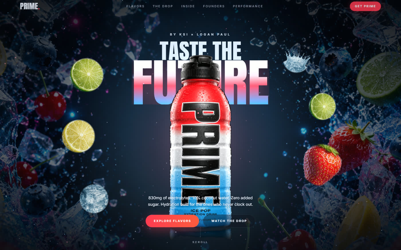
WebGL Hero
A Three.js scene places the bottle in a particle field of ice, fruit and floating orbs — depth you can feel rather than a flat hero image.
Electrolytes & Performance
The spec — 830mg electrolytes, 10% coconut water, zero added sugar — told as scroll-revealed story beats instead of a nutrition table.
Live Accent Theming
Background glow, particles, copy and CTA all sync to the active flavor through one CSS variable that propagates site-wide.
Runtime Cutouts
Bottle shots arrive on a black studio backdrop; the site flood-fills the background away at load, keeping the black cap and lettering intact.
04Craft Notes
The cutout problem — the bottle art came on a pure-black backdrop, and the bottles have black caps and black lettering. A naive "make black transparent" key would erase the product too, so the site flood-fills only the black connected to the image border — background gone, cap and label intact.
Hiding the work — that processing happens at load, so the loader screen exists to cover it. The reveal is the payoff for a beat of honest waiting.
Smooth-seek — video can't be scrubbed frame-accurately on every device, so the playhead eases toward a scroll-mapped goal each frame instead of snapping. That's what makes it feel like film rather than a slideshow.
One ticker — Lenis smooth scrolling is driven by the GSAP ticker, so scroll, pinning and scrubbing all share a single clock and never fight each other.
05What I Learned
Motion is a material, not a garnish
Animation added at the end always looks bolted on. Here the scroll choreography was the concept, so the layout could be built to serve it.
Constraints in the asset are design problems
A black-on-black product could have meant hours of masking. Solving it as a rule the site runs itself kept the art direction free to change.