Home About Work Skills Let's Talk
Websites
Flavr – Food Delivery Website Live 01
Web Design · Product Design
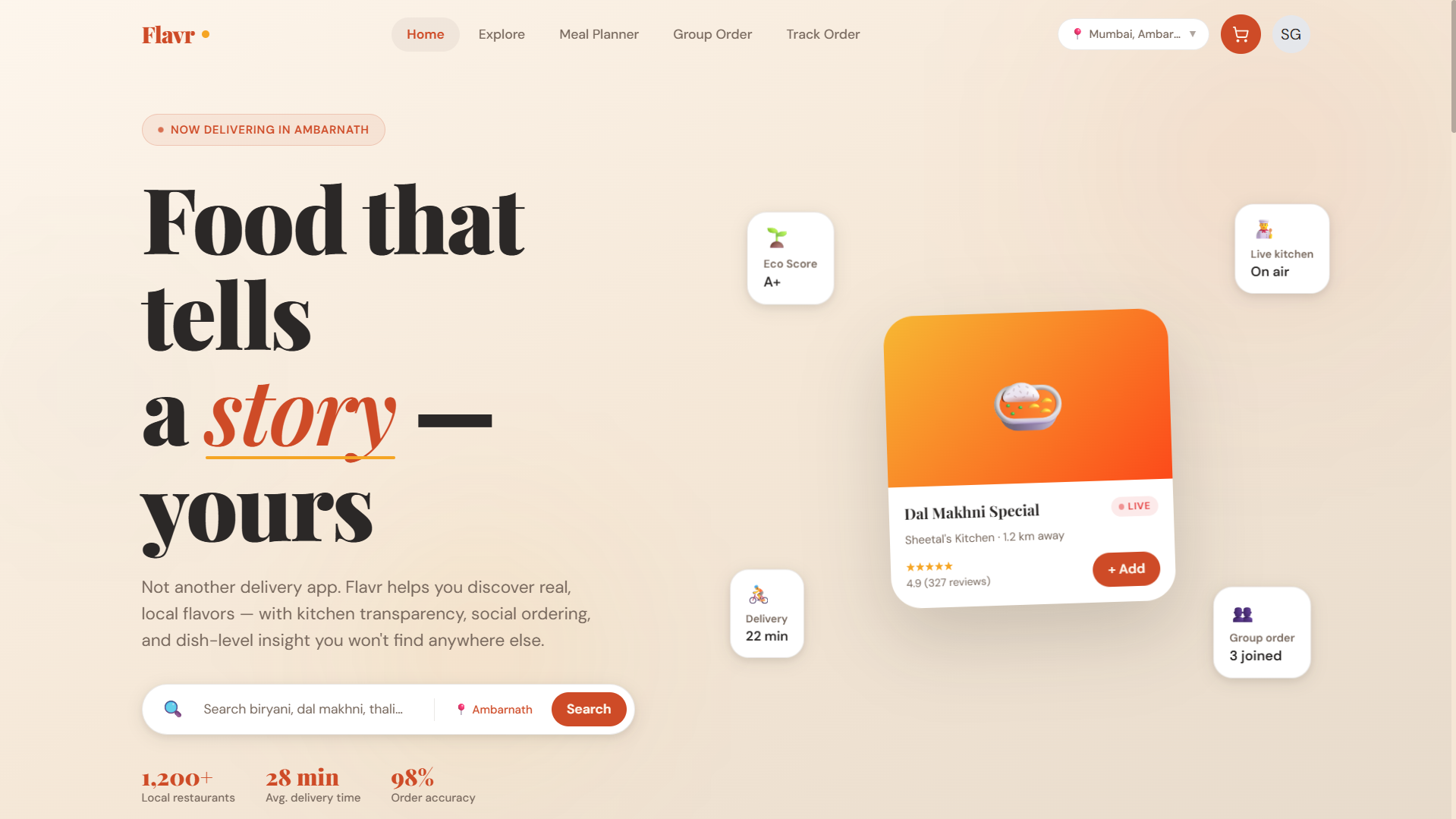
Flavr — Food
Delivery Website

A next-generation food delivery experience that goes beyond Zomato & Swiggy — with unique social features, real-time kitchen transparency, and a hyperlocal discovery engine.

Web Design UX Research Wireframing Prototyping Figma
View Live Site
SmartSanstha – Civic Learning Platform BE Major Project 02
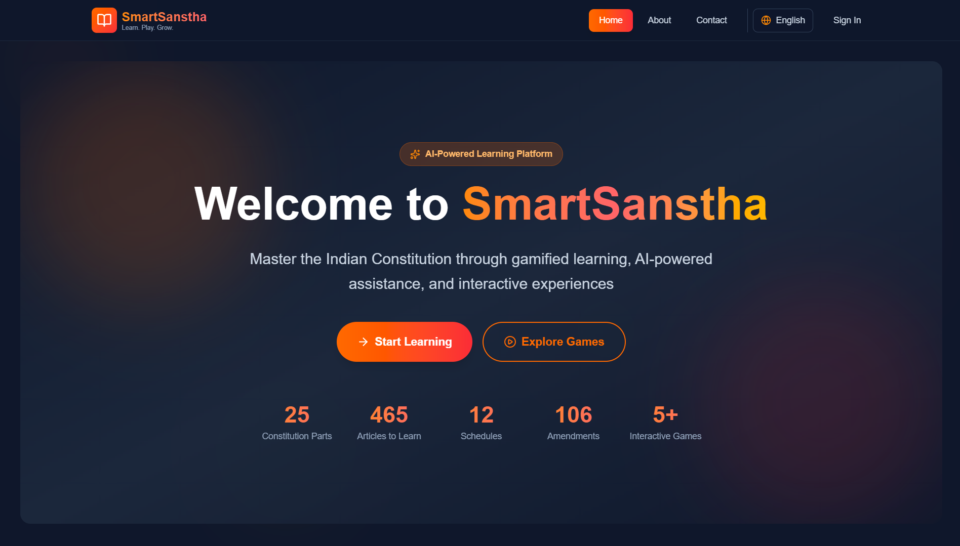
Product Design · EdTech · UI/UX

Smart
Sanstha

A gamified platform to make the Indian Constitution accessible and engaging — featuring constitutional quizzes, courtroom simulations, an AI chatbot, and adaptive learning modules.

Product Design EdTech Dashboard UI Information Architecture Figma
View Live Site
🎵 Redesign 03
Mobile App · UI/UX Redesign

Spotify
Redesign

Rethinking Spotify's mobile experience — introducing a light mode, improving feature discoverability, and making navigation more intuitive for everyday listeners.

Figma UI Design UX Research Mobile App Interaction Design
Canva Designs & Templates

Visual Content
Creation

A curated set of social media creatives, promotional posters, carousels, blog covers, and short-form video content — all designed in Canva for real brands and digital campaigns.

Canva Pro Canva AI Tools Brand Kit Social Media Content Design Template Design
Brand Posters
Prime Energy Drink – Iceberg Poster
Prime Energy — Iceberg Product Poster · Canva
Prime Energy Drink – Sky Poster
Prime Energy — Sky Product Poster · Canva
Porsche 911 GT3 Poster
Porsche 911 GT3 Automotive Poster · Canva
Social Media Carousels
Social Media Growth Tips Business Carousel · Canva · 6 slides
Fall Game Releases Gaming Page Carousel · Canva · 6 slides
Blog Cover Designs (5 Covers)
Music Blog Cover · Canva
Gaming Blog Cover · Canva
Tech Blog Cover · Canva
Lifestyle Blog Cover · Canva
Finance Blog Cover · Canva
Short-Form Video / Reel
Fitmaize — Brand Reel Female Fitness & Diet · Instagram Reel · Canva

Client: Fitmaize — a female fitness influencer and dietician brand focused on healthy lifestyle content.

Designed and animated a short-form Instagram Reel in Canva to drive audience engagement and brand awareness. The reel uses branded colour palettes, motion text, and punchy messaging to capture attention in the first 3 seconds.

Tools: Canva Animate, Beat Sync, Magic Resize for Stories & Reels format.

Canva Animate Reel / Stories Motion Design Fitness Niche
Preview
Case Study · 03

Spotify
Redesign

TypeUI/UX Redesign
PlatformMobile App
ToolsFigma
DurationConcept Project
🎵
3
Core UX problems addressed
1
New feature surfaced in nav
2
Theme systems designed
100%
Focused on mobile-first usability

01Project Overview

This project began with a simple question: why does one of the world’s most polished music apps still feel frustrating in everyday use?

Spotify is feature-rich, but some of its UX decisions make important features hard to discover and common actions harder than they should be. My redesign focused on improving usability without losing Spotify’s familiar identity.

02Problem Statement

“A powerful product becomes weaker when its most useful features are hidden behind habit and clutter.”
🌙 No Light Mode
Spotify’s dark-only experience may feel premium, but it doesn’t work equally well for every environment or every user preference.
🔍 Discovery is Buried
A feature as important as discovering new music should not feel hidden inside Search. It deserves stronger visibility and easier access.
📱 Poor Thumb Reach
Frequently used controls are not always placed where one-handed mobile use feels natural.
⚡ Too Many Steps
Core actions like sharing, adding to playlists, and accessing lyrics create unnecessary interaction friction.

03Goals

01
Improve Accessibility
Introduce a visually comfortable light mode without losing Spotify’s brand energy.
02
Surface Discovery
Make music exploration feel like a core feature instead of a hidden one.
03
Reduce Friction
Shorten the path between user intent and user action.
04
Respect Familiarity
Keep the redesign recognizably Spotify instead of redesigning for the sake of novelty.

04Design Decisions

Light Mode System: I designed a softer light interface using off-whites and muted grays so the app feels bright without becoming visually harsh.

Discover on Bottom Navigation: I promoted Discover to the navigation bar to improve visibility and encourage more exploratory behavior.

Now Playing Improvements: I restructured the player so the most common actions sit closer to the thumb zone and feel easier to reach.

Cleaner Information Priority: I reduced competing visual emphasis so users can focus faster on what matters most.

UI Focus
Theme consistency, spacing rhythm, hierarchy, and cleaner touch targets.
UX Focus
Discoverability, reachability, fewer taps, and stronger navigation clarity.
Light Mode System Discover Visibility Thumb Zone Optimization Mobile Interaction Design Component Refinement Design Consistency

05Outcome

+1
Feature promoted to primary nav
2
Theme directions explored
4
Key interaction flows improved

06What I Learned

Small UX changes can feel massive

Sometimes the most meaningful redesign isn’t about inventing something new — it’s about placing the right feature in the right place.

Theme systems require discipline

Designing both dark and light experiences taught me how important consistency, contrast, and reusable design tokens really are.

Case Study · 01

Flavr — Food
Delivery Website

TypeProduct Design
PlatformResponsive Web
ToolsFigma + HTML/CSS
StatusLive ↗
View Live Site — siddhant810.github.io/Flavr
Flavr Website Screenshot
6
Differentiating product features
4
Primary screens explored
1
Design system direction
100%
Built around local discovery

01Project Overview

Most food delivery apps solve the same problem in almost the same way: speed, offers, and infinite scrolling restaurant lists.

This concept explores a different direction — a platform that feels more human, local, and trustworthy. Instead of just helping users order quickly, it helps them discover better food experiences.

02Opportunity

“What if a food platform felt less like a transaction engine and more like a city guide for eating well?”

The opportunity here was not to compete by copying Zomato or Swiggy, but by solving overlooked emotional and trust-based gaps in the experience:

Trust Gap
Users rely heavily on ratings, but still feel uncertain about food quality and consistency.
Discovery Fatigue
Large apps often over-prioritize sponsored listings instead of truly relevant local gems.
Weak Social Ordering
Group ordering still feels clunky, especially for office teams and friend circles.
Lack of Dish-Level Insight
People often care more about one specific dish than the restaurant overall.

03Product Direction

01
Trust Through Transparency
Use features like live kitchen visibility and dish-level reviews to reduce uncertainty.
02
Local Discovery
Highlight hidden neighborhood food spots instead of algorithm-heavy mainstream repetition.
03
Collaborative Ordering
Make shared ordering genuinely easy for groups.
04
Warm Visual Identity
Design the interface to feel appetizing, modern, and emotionally inviting.

04Key Features

🔴 Live Kitchen Cam
Build trust by letting restaurants optionally show live prep visibility.
👥 Group Ordering
Allow multiple users to add to a shared cart with cleaner split flows.
🏘️ Hyperlocal Discovery
Help users discover small hidden gems, tiffin services, and local kitchens.
🌱 Sustainability Score
Add ethical decision-making as a visible part of restaurant evaluation.
💬 Dish Reviews
Review individual menu items rather than flattening everything into restaurant-level ratings.
📅 Meal Planning
Encourage repeat value through weekly meal planning and habit-based ordering.

05Design Thinking

Homepage Strategy: I designed the homepage to feel editorial rather than purely transactional — using curated sections, stronger storytelling, and more appetite-led browsing.

Dish-First Experience: Instead of burying dishes inside restaurant pages, I treated dishes as first-class content objects with richer metadata.

Simplified Checkout: The checkout flow was intentionally reduced to a cleaner 3-step structure to reduce drop-off and confusion.

Warm Brand Language: The palette, typography, and card system were chosen to feel flavorful and premium without becoming visually noisy.

Product Thinking UX Strategy Feature Innovation Wireframing User Flows Responsive Layout Checkout Design Food Discovery UX

06Progress So Far

4
Primary screens designed
6
Core features defined
1
Visual system direction created

07What I Learned

Good product design is not feature stuffing

The challenge is not adding “cool” ideas — it’s making sure those ideas support a believable and usable experience.

Positioning matters as much as UI

This project taught me that a product’s uniqueness often comes more from what problem it chooses to solve than from how polished the interface looks.

Case Study · 02

Smart
Sanstha

TypeBE Major Project
DomainEdTech + Civic Learning
RoleUI/UX Designer
Team4 Members
View Live Site — smartsanstha-7hqc.onrender.com
SmartSanstha Website Screenshot
6
Core product modules
40+
Figma screens
1
Full component system
448
Articles made more approachable

01Project Overview

SmartSanstha is a civic-learning platform designed to make the Indian Constitution easier to understand, explore, and engage with.

The problem wasn’t a lack of information — it was a lack of accessibility, clarity, and motivation. My role was to help transform a dense legal subject into an experience that feels modern, interactive, and less intimidating.

02Problem Statement

“People don’t avoid the Constitution because it lacks importance. They avoid it because the experience of learning it has been designed badly.”
📖 Dense Legal Language
The original material feels difficult and inaccessible for many users, especially students and first-time learners.
😴 Low Engagement
Traditional educational formats create passive learning instead of active curiosity.
🌐 Accessibility Gaps
Many existing resources fail to support mobile-first, multilingual, or low-literacy use cases.
❓ Weak Real-World Context
Users often don’t understand how constitutional concepts connect to daily life and citizenship.

03Product Strategy

01
Simplify Learning
Break complex content into smaller, more understandable learning units.
02
Increase Engagement
Use gamification and simulations to encourage curiosity and repeat usage.
03
Make it Practical
Connect constitutional learning to real-life scenarios and user questions.
04
Design for Inclusion
Ensure accessibility, readability, and future support for broader audiences.

04Core Features

🎮 Constitutional Games
Mini-games that turn article-based learning into an active experience.
🏛️ Courtroom Simulation
Scenario-based interaction where users engage with constitutional reasoning more practically.
🤖 AI Constitution Chatbot
A conversational layer that answers constitutional questions in simpler language.
📊 Adaptive Quizzes
Quiz difficulty evolves with the learner’s progress and confidence.
👤 User Dashboard
A progress system with XP, streaks, achievements, and learning summaries.
📚 Article Library
A cleaner, more understandable way to browse constitutional content.

05My Contribution

Information Architecture: I helped structure the platform so that learning modules, games, quizzes, and article references feel connected instead of fragmented.

Onboarding Design: I designed an onboarding flow to personalize the learning path based on interest level and goals.

Gamification UI: I created the visual system for XP, streaks, badges, and progress motivation.

Courtroom Simulation UI: One of the most complex design challenges — balancing debate flow, references, and interaction clarity in one screen.

Accessibility & Design System: I worked on contrast, typography hierarchy, reusable components, and a more scalable UI language.

Information Architecture Gamification Design Component Library Onboarding UX Dashboard Design Courtroom UI Accessibility Responsive Design

06Impact

6
Major modules designed
40+
UI screens created
1
Structured design system built

This project pushed me beyond interface design into real product thinking — designing not just for beauty, but for education, behavior, and social relevance.

07What I Learned

Complex subjects need emotional design

If a subject feels intimidating, good UX has to reduce that intimidation before learning can even begin.

Good structure is invisible power

Strong information architecture can make a complicated platform feel natural, even when the content itself is dense.