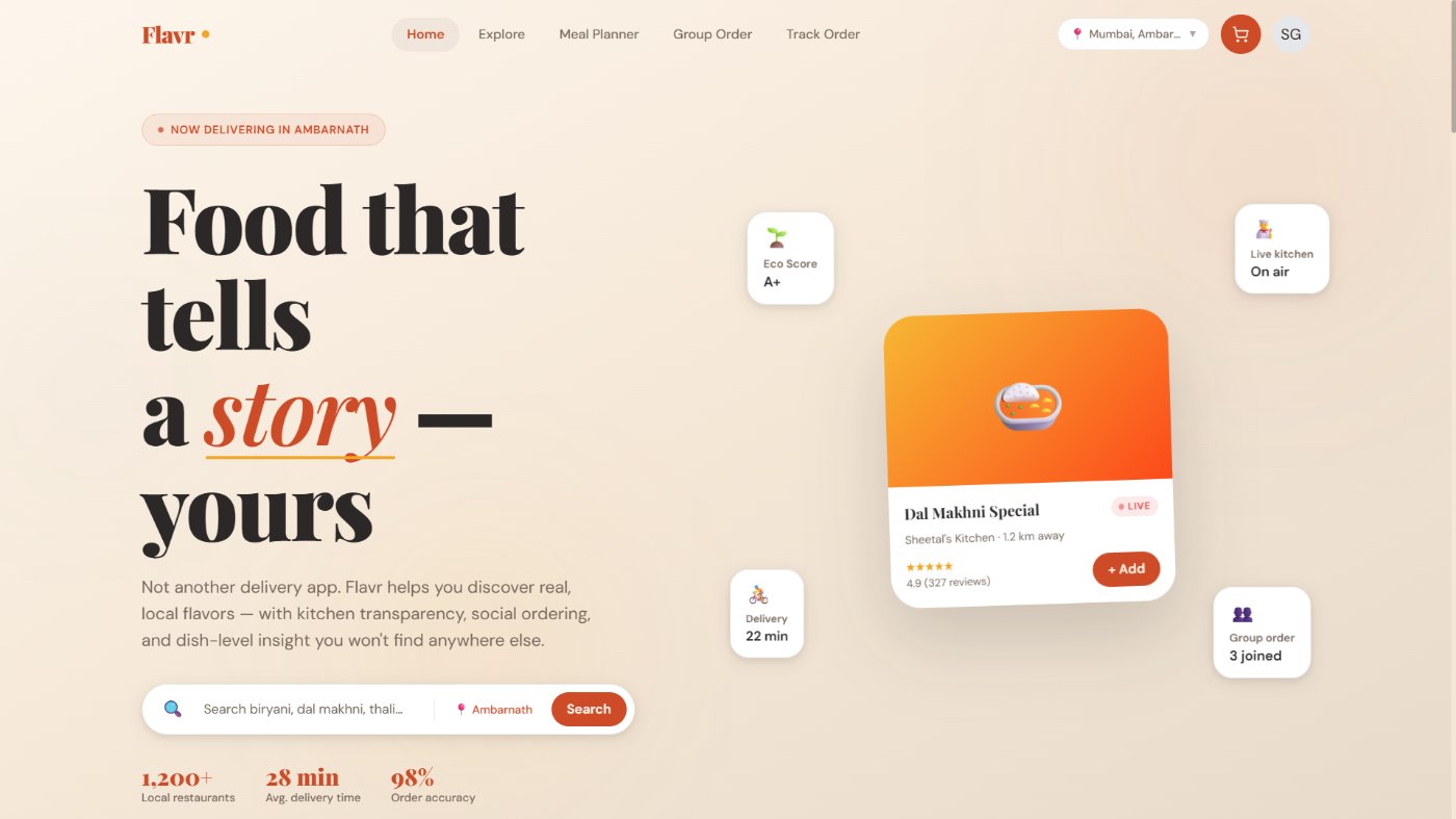
01Overview
Most food delivery apps solve the same problem the same way: speed, offers, and infinite restaurant lists.
This concept explores a different direction — a platform that feels more human, local, and trustworthy. Instead of just helping users order quickly, it helps them discover better food experiences.
02Opportunity
What if a food platform felt less like a transaction engine and more like a city guide for eating well?
The opportunity wasn't to copy Zomato or Swiggy, but to solve overlooked emotional and trust-based gaps:
Trust gap
Users rely on ratings but still feel uncertain about food quality and consistency.
Discovery fatigue
Large apps over-prioritise sponsored listings over truly relevant local gems.
Weak social ordering
Group ordering still feels clunky — especially for office teams and friend circles.
No dish-level insight
People often care more about one specific dish than the restaurant overall.
03Product Direction
Trust through transparency
Live kitchen visibility and dish-level reviews to reduce uncertainty.
Local discovery
Highlight hidden neighbourhood spots over algorithm-heavy repetition.
Collaborative ordering
Make shared ordering genuinely easy for groups.
Warm visual identity
An interface that feels appetising, modern, and emotionally inviting.
04Key Features
Live Kitchen Cam
Build trust by letting restaurants optionally show live prep visibility.
Group Ordering
Multiple users add to a shared cart with cleaner split flows.
Hyperlocal Discovery
Surface small hidden gems, tiffin services, and local kitchens.
Sustainability Score
Make ethical decision-making a visible part of restaurant evaluation.
Dish Reviews
Review individual menu items, not just restaurant-level ratings.
Meal Planning
Drive repeat value through weekly meal planning and habit-based ordering.
05Design Thinking
Homepage strategy — designed to feel editorial rather than transactional, using curated sections and appetite-led browsing.
Dish-first experience — dishes treated as first-class content objects with richer metadata, not buried inside restaurant pages.
Simplified checkout — reduced to a cleaner 3-step structure to cut drop-off and confusion.
Warm brand language — palette, type, and cards chosen to feel flavourful and premium without visual noise.
06What I Learned
Good product design is not feature stuffing
The challenge is not adding "cool" ideas — it's making sure they support a believable, usable experience.
Positioning matters as much as UI
A product's uniqueness often comes more from which problem it solves than how polished the interface looks.